Most coins are built to disappear into the day: spent, stacked, and forgotten. The exceptions are the pieces that reveal a small manufacturing miss a missing letter, the wrong die, an edge that was never finished, or a design detail that should not be there at all.
That is what keeps modern error hunting so compelling. Some of the best-known finds did not begin in museum trays but in coin rolls, change jars, proof sets, and ordinary household accumulations. The trick is learning which odd-looking details point to a real mint-made variety and which ones are only damage.
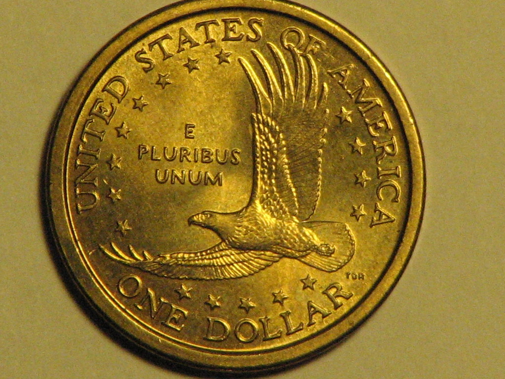
1. Sacagawea dollar and Washington quarter mule
This remains one of the strangest modern U.S. coins because it combines two denominations that were never meant to meet. The coin shows Washington’s portrait from the quarter on one side and the Sacagawea dollar reverse on the other, all struck on a golden-colored dollar planchet. That visual mismatch is the whole clue: a “quarter” image on a dollar-sized coin should stop anyone cold.
Its rarity is part of the legend, with approximately 11 known in widely cited reference material. Even so, the coin’s hold on collectors comes from something more basic: it looks impossible at a glance, yet it exists.
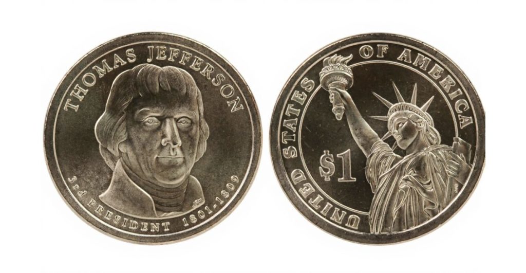
2. Presidential dollars with missing edge lettering
Some errors stand out because something important never happened. Presidential dollars introduced edge inscriptions, but a portion left the production process without them. A normal coin should show lettering around the rim; an error piece has a smooth edge instead.
The Minting mistake was simple in concept but easy to miss in daily life because most people examine only the front and back of a coin, not the side. On these dollars, the edge matters as much as the portrait. Reference guides note examples that skipped the step where the lettering and date were added to the edge, turning a routine dollar into a piece collectors still check for by rolling the coin between two fingers.
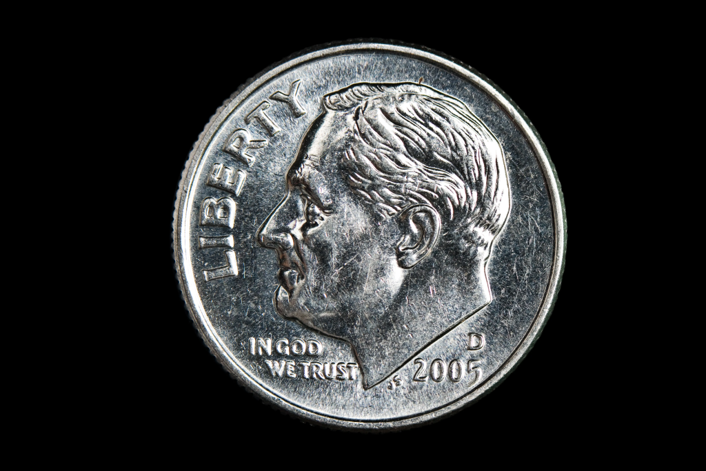
3. The 1975 “No S” proof Roosevelt dime
Proof coins are supposed to be the polished, closely watched side of coin production, which makes this dime especially striking. The missing “S” mintmark should appear plainly on a San Francisco proof, and on this issue it does not. Only two confirmed examples are widely recognized.
Unlike circulating errors, this one is more likely to surface through inherited sets and long-stored collections than in a cash register. That domestic route is part of its fascination: a major rarity can sit in an old proof package simply because nobody checked the mintmark closely.
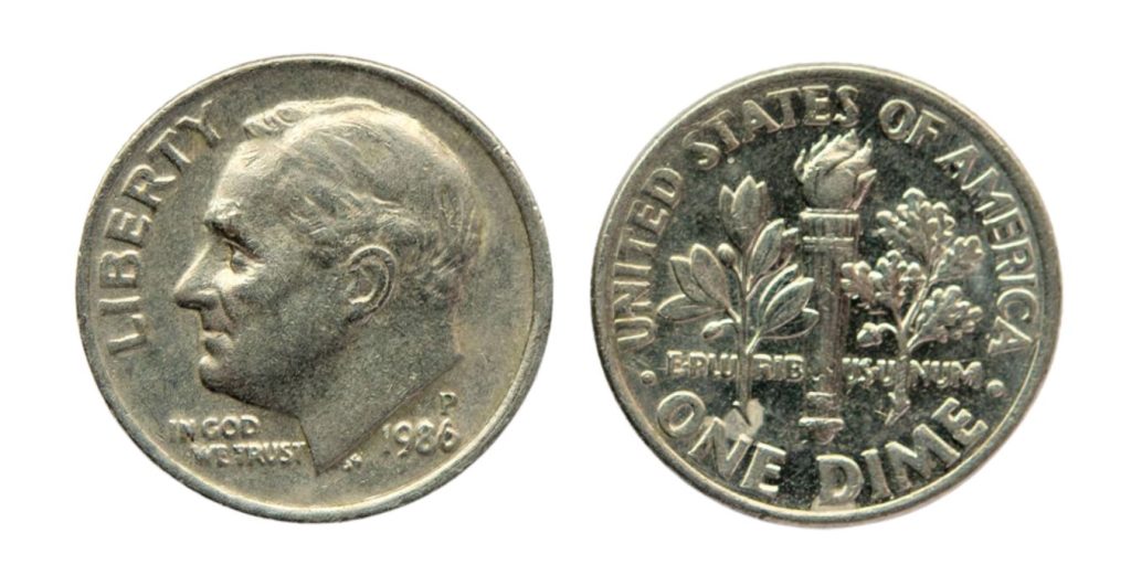
4. The 1982 “No P” Roosevelt dime
This is one of the more approachable modern error coins because it came from circulation strikes rather than a special collector format. By 1982, Philadelphia dimes were supposed to carry a “P,” but some were released without it. The missing letter is small, yet the story behind it is not.
It also offers a useful lesson in caution. Missing mintmarks attract attention, but damaged coins and altered pieces can mislead beginners. On a genuine example, the area where the “P” belongs was never punched into the die in the first place, rather than being scraped away later.
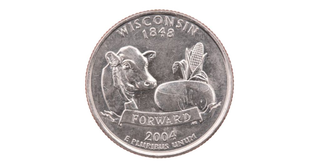
5. The 2004-D Wisconsin quarter with an extra leaf
State quarters produced their own form of treasure hunt, and the Wisconsin issue remains one of the most recognizable. On the reverse, the ear of corn shows an extra leaf shape that should not be there. Collectors generally separate the variety into High Leaf and Low Leaf forms.
This is one of the rare modern standouts that can often be checked without magnification. The design is bold enough that a careful eye can spot it while sorting quarters by hand, especially because two varieties are known.
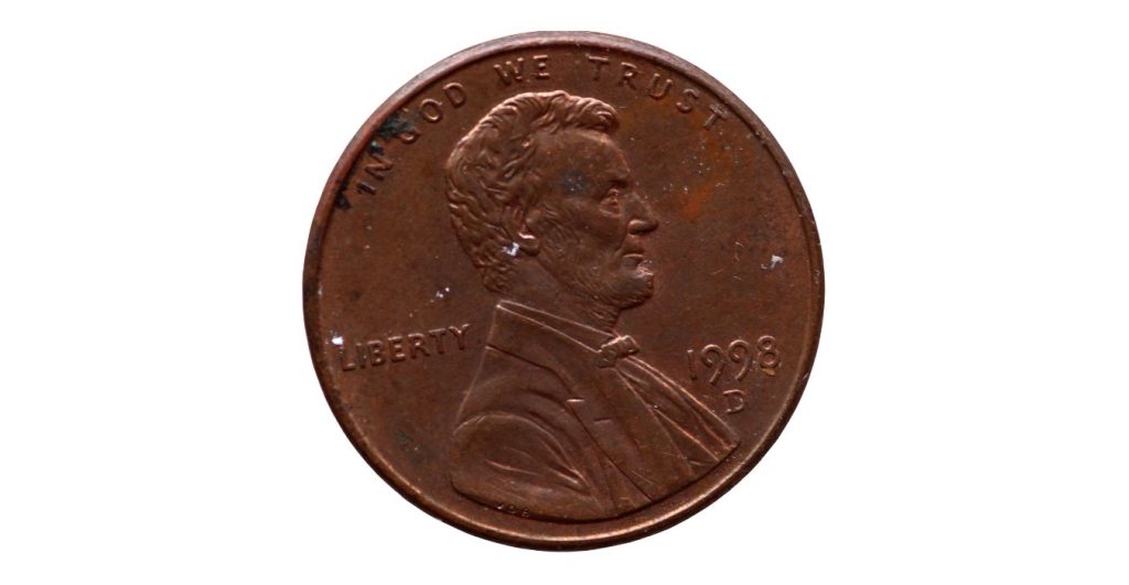
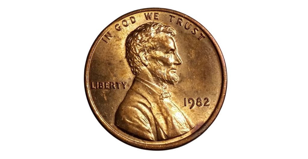
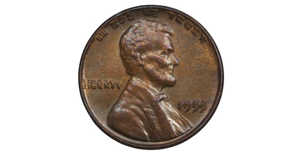
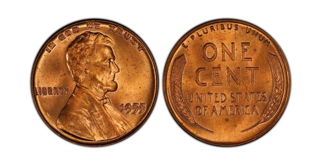
6. Lincoln cents with Close AM and Wide AM reverses
Pennies hide some of the subtlest modern varieties. On certain dates, the spacing between the A and M in AMERICA on the reverse signals that the wrong reverse design was used. The main headline rarity is the 1992 and 1992-D Close AM, but later cents from 1998, 1999, and 2000 are known for the opposite mistake: Wide AM reverses on business strikes.
The detail seems tiny until it is seen side by side. Specialists also use the placement of the designer’s initials FG as a cross-check, because the initials can confirm what worn lettering sometimes obscures. On Lincoln cents dated 1998, 1999, and 2000 business strike cents, that spacing difference became one of the most searched-for penny diagnostics in circulation hunting.
7. True doubled dies, not ordinary doubling
Many coins look blurry after hard use, but true doubled dies are something else entirely. They begin at the die-making stage, so the doubling is built into the design and repeats on every coin struck from that die. That is why collectors focus on crisp, shaped doubling in letters and numbers rather than flattened, shelf-like distortion caused by strike issues. The distinction matters because ordinary machine doubling is common and usually minor, while a true doubled die can turn a familiar cent into a serious find. Collectors still watch for examples such as the 1995 doubled die cent, but the broader rule is more useful than any one date: trust clean design separation, not a fuzzy outline.
A 6x magnifier, steady light, and a habit of checking dates, rims, and lettering do more than luck ever will. Modern error coins are not hidden because they are invisible; they are hidden because most people never pause long enough to look. That makes pocket change less predictable than it seems. A coin can be ordinary in every way except one tiny detail, and that single detail can move it from spare change to a lasting curiosity.