‘A nuclear war cannot be won and must never be fought.’ This phrase, often used by U.S. presidents, is also the best translation of what the science of nuclear fallout is constantly repeating to the public: that even the ‘least exposed’ regions remain part of the same national system of food, water, power, health care, and supply chains.
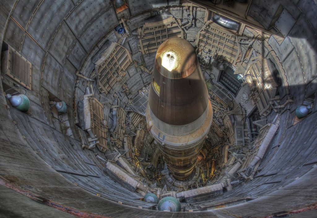
Nevertheless, more accurate models have at least made one narrow question easier to answer without claiming it is the only one that matters. Today, high-resolution simulations follow how radioactive dust from ground bursts might move with changing weather patterns over the country’s land-based missile fields to create maps showing where immediate four-day doses of radiation are normally lower, especially when prevailing winds blow plumes away.
These areas are not “safe zones.” They are areas that tend to be farther from the heaviest ICBM silo targets and, in many cases, beyond the worst of the downwind plume.

1. Maine
Maine’s distance from the missile fields is a big reason why it tends to be at the low-exposure end of the fallout maps, with modeled four-day doses as low as 0.001 to 0.5 Gy. This range is important because it is where “maps” become “biology,” with doses above 1 Gy causing acute radiation sickness and doses above 8 Gy generally considered to be a certain death, except in extraordinary circumstances. Maine’s benefit is simply that the plume is spending its early, most intense hours elsewhere.

2. New Hampshire
New Hampshire is often lumped together with the rest of northern New England in modeling that focuses on the fact that it is not just distance that affects the area, but also the direction of the wind. The point is not that the radioactive material will not be able to reach it, but that in most of the patterns that have been modeled, the plume of the highest concentration will have fallen out of the air well before it reaches the Northeast. When the quality of shelter is taken into account, larger buildings decrease indoor exposure compared to outdoor exposure, adding another level of variability.

3. Vermont
The “lower exposure” status of Vermont in average case maps is due to the same physics: particulate fallout will decrease most rapidly in the first day or two, and areas that are not near ground burst targets will avoid the highest dose window. Modern dispersion models also account for more complete radionuclide mixtures than older Cold War models, including decay chains that might otherwise be underappreciated. This adds realism to dose calculations over time, which is why “low” does not mean “negligible.”

4. Massachusetts
Massachusetts usually finds itself well out of the most direct plume paths in many silo attack scenarios, particularly when the prevailing winds are such that the heaviest fallout remains centered over the Plains and Upper Midwest. The implications are small but not insignificant: reduced four-day doses offer a bit more leeway for mitigative measures, such as remaining indoors during the period in which radiation concentrations decrease most sharply. Again, the first 48 hours represent the steepest dose-response gradient.

5. Rhode Island
Smaller states are not necessarily safer, but Rhode Island’s proximity to the coast and its distance from the missile fields tend to put it into lower dose bands on average-case maps. The “hidden” problem is that even with lower levels of radiation, the effects of the “low plume” outcome can be exacerbated by the characteristics of urban systems, which can translate a “low plume” outcome into a serious public health crisis.

6. Connecticut
Connecticut tends to be grouped in the same lower exposure area as the rest of New England in simulations that focus on silos. This gives the state a benefit, but only dependent on what is being targeted. It has been commonly observed that other target lists, such as command centers, seaports, and industrial nodes, would redraw the map. One of the reasons that several scenarios are created is that a “best” spot for one scenario may become a dangerous route for another.

7. New York
The image for New York is mixed: upstate regions may resemble New England’s lower-dose patterns, while downstate density concentrates risk through logistics and health system challenges. The more sophisticated the model, the clearer it becomes that the effects are not merely radiological. John Erath, Senior Policy Director for the Center for Arms Control and Non-Proliferation, encapsulated this point succinctly: “Nowhere is truly ‘safe’ from fallout and other consequences like contamination of food and water supplies and prolonged radiation exposure.”

8. Washington
On the West Coast, Washington State is often found in “less affected” categories on silo attack maps because the winds are typically blowing from west to east. In certain circumstances, the modeled dose to coastal regions is on the order of 0.001 Gy, which is roughly the same order of magnitude as the annual limit on public exposure, an instructive comparison, even if a nuclear detonation is not a regulatory occurrence. Geography is helpful but does not obviate interdependence.
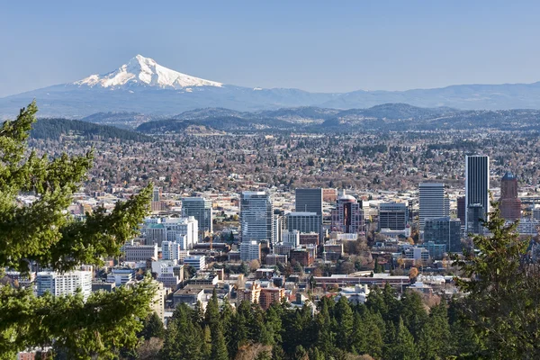
9. Oregon
Oregon often joins Washington in having the benefit of the coastline in silo-based dispersion modeling. However, the same research that increases the accuracy of these maps also makes their message less reassuring: the variability of the wind can direct dangerous plumes into unexpected paths, and on a macro-level, disruption can taint food and water sources well beyond the areas of heaviest fallout. These maps are best understood as a means to an end in emergency planning, rather than a guide to individual invincibility.
In each of these locations, the most general scientific truth is not that a few states “win” a harsh geographic lottery. It is that risk is a dynamic target that depends on wind, burst height, particle size, building protection, and the failures that follow any large-scale attack. Fallout maps may help to explain relative risk in the early days. They cannot circle the tail of risk that extends through the systems people use to live.