Fallout maps do not identify “safe” states. They show gradients of risk shaped by missile field geography, prevailing winds, rainfall, and the difference between direct blast zones and downwind contamination. That distinction matters. Recent modeling tied to attacks on U.S. land-based missile silos suggests that the heaviest average fallout burden clusters across the northern Plains and nearby regions, while some states farther from those silo fields appear lighter on broad exposure maps. The lighter label reflects relative positioning, not protection from the wider human and environmental consequences of nuclear war.

1. Maine
Maine appears lighter on broad fallout visualizations because it sits far from the main belt of U.S. silo-based missiles in the northern interior. The densest concentrations of those silos are associated with installations in states such as Wyoming, Montana, and North Dakota, where missiles are intentionally dispersed across wide areas to reduce vulnerability to attack. Average-risk maps derived from 365 simulations using 2021 weather data emphasize how distance from those launch fields affects expected contamination patterns. Maine’s position on the far northeastern edge of the country places it outside the central corridors that repeatedly collect higher modeled doses.

2. Florida
Florida often looks lighter in silo-strike fallout maps because the most severe modeled plumes originate much farther north and west. In these scenarios, wind transport remains decisive, but repeated simulations still leave the peninsula with lower average exposure than states closer to the missile complex. That does not make Florida irrelevant to nuclear risk. Research tied to U.S.-Russia escalation scenarios has warned of consequences far beyond silo regions, including immediate casualties and later disruptions to climate and food systems.
3. Georgia
Georgia’s lighter shading on these maps reflects geography more than immunity. The state is removed from the land-based missile fields that critics and defenders alike discuss in debates over the “nuclear sponge,” the idea that enemy warheads would be drawn toward remote silos rather than denser population centers. The concern, as fallout studies repeatedly show, is that ground bursts against silos loft radioactive debris into the atmosphere and spread it far beyond the point of detonation. Georgia generally falls outside the highest average exposure zone in those silo-focused models.

4. South Carolina
South Carolina is another southeastern state that tends to show lighter average fallout exposure in silo-attack simulations. Its relative distance from the northern Plains reduces the chance of repeatedly landing under the densest modeled plumes over a year of varying weather conditions. Even so, lighter exposure on one class of map should not be confused with low overall nuclear vulnerability. As Princeton researchers have noted in work on broader conflict modeling, fallout is only one part of a much larger catastrophe involving blast, fire, radiation, infrastructure collapse, and mass casualties.

5. Alabama
Alabama sits outside the core region identified in average-dose estimates where nearby communities could face especially severe radiation burdens after attacks on missile silos. In the Brown-Princeton analysis, the highest average doses were concentrated much closer to the silo belt and adjoining downwind areas. A longer view sharpens the point. The maps track fallout across North America for 48 hours and integrate cumulative outdoor dose over four days, illustrating how regional differences emerge over time rather than in a single snapshot.

6. Mississippi
Mississippi also appears on the lighter side of national fallout maps tied specifically to silo strikes. Its location in the Deep South keeps it removed from the states identified as bearing the brunt of average exposure, especially across the upper Midwest and northern Plains. Those patterns are shaped by both origin and atmosphere. The underlying simulations use NOAA HYSPLIT atmospheric transport modeling, which traces how radioactive particles move under changing meteorological conditions rather than assuming a fixed plume.

7. Louisiana
Louisiana’s lighter placement stems from the same broad logic: farther from likely silo targets, farther from the most repeatedly affected fallout corridors. On national maps, that puts it below the average exposure seen in states nearer the central missile fields. This is a narrow finding with a very limited comfort value. Scientific discussion around nuclear conflict increasingly emphasizes that regional fallout maps cannot capture the full toll of a large exchange, especially when urban and industrial targets are considered alongside missile bases.
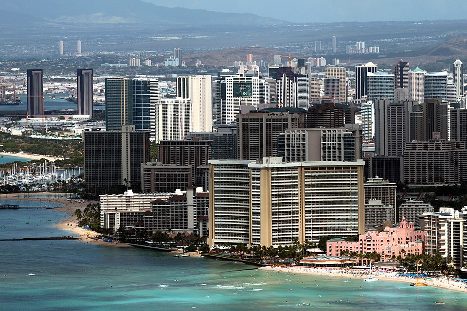
8. Hawaii
Hawaii stands apart because it is geographically detached from the continental missile fields used in these modeling exercises. A map centered on attacks against 450 U.S. silos naturally assigns much lower direct fallout exposure to a state far outside North American plume tracks. Yet Hawaii’s distance does not remove it from the global implications described by climate researchers. Alan Robock’s work, highlighted in reporting on silo-strike fallout, connects nuclear war to “nuclear winter” and global food supply impacts.
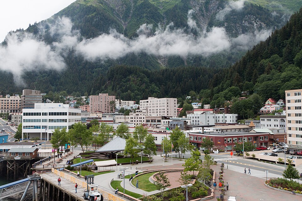
9. Alaska
Alaska also reads as lighter on continental fallout maps focused on silo attacks, largely because it is separated from the main target set and prevailing downwind paths shown in the lower 48. Its position reduces average exposure in this particular modeling frame. That frame is crucial. These maps do not portray every possible nuclear target or every pathway to harm. They describe one scenario family: concerted attacks on U.S. silo-based missiles, which researchers estimate could still lead to 1 to 2 million deaths on average even when people are assumed to shelter for several days.
The broader lesson from these maps is not that a handful of states escape danger. It is that fallout risk is uneven, and that unevenness follows infrastructure, distance, and weather. States nearest the silo fields carry the darkest burden in average simulations, while some coastal and noncontiguous states appear lighter by comparison. Even the lighter zones remain inside a national and global system of consequence. Princeton’s wider escalation modeling has described a plausible conflict in which more than 90 million people could be dead and injured within hours, a reminder that maps of relative exposure are best read as warnings about scale, not reassurance about survival.